Project 2

Project 2

Project 2

Redesigning the pharmacy procurement experience to reduce operational friction, improve scalability, and help pharmacies order independently without relying on sales representatives.

Project Overview

OGApharmacy Marketplace is a digital procurement platform that allows pharmacies and affiliates to order pharmaceutical products more efficiently.

However, as the platform grew, several operational and usability challenges started affecting both the business and its users.

The experience was functional, but it wasn’t optimized for speed, repeat ordering behavior, scalability, or independent self-service usage.

As a result, many pharmacies still relied heavily on sales representatives to place orders on their behalf instead of confidently navigating the platform themselves.

This created unnecessary operational dependency, slowed procurement, and limited the platform’s ability to scale efficiently.

My role was to rethink the ordering experience from the ground up, improving navigation, restructuring discovery, simplifying procurement flows, and creating a faster, more intuitive experience that supported repeat purchasing behavior.

Role:
Timeline:
Team:
Tools Used

Product Designer (UX, UI, Research, Interaction Design)

3 weeks

Collaborated with Design and Product Management team (Team of 8)

Figma, Google sheet, notion

Problem Statement

When I first engaged with the OGApharmacy Marketplace, I started by looking at the situation from a business perspective rather than immediately jumping into interface issues.

From a business standpoint, the platform was facing a core challenge:

The ordering experience was not efficient enough to support scalable, repeat procurement behavior.

Even though users could technically place orders successfully, the experience created friction that slowed adoption, reduced efficiency, and increased dependency on internal operational support.

As I spent more time understanding the platform, I noticed that many pharmacies still depended heavily on sales representatives to place orders on their behalf instead of independently using the marketplace.

This signaled a deeper product issue.

The problem was no longer just about usability, it was about whether the system was intuitive and efficient enough to support self-service procurement at scale.

User Experience & Navigation Issues
  • Users were not experiencing a clear or guided journey when trying to place orders.

  • Instead of being able to quickly find and purchase products, they were confronted with a system that felt unstructured and overwhelming.

  • The marketplace lacked proper product categorization, which meant users were exposed to too many products at once. This not only made discovery difficult, but also impacted performance, causing slower load times and reducing efficiency in browsing.

  • On top of this, the navigation structure felt outdated. It relied heavily on a side panel system that didn’t match modern marketplace expectations, making the experience feel less intuitive compared to standard e-commerce platforms users were familiar with.

  • Another major friction point was entry into the system itself. Users were not landing directly on the marketplace, instead, they were often taken to the “Manage Orders” page first. This created an unnecessary step before users could even begin shopping, slowing down the entire ordering journey.

Operational Dependency on Sales Representatives

Another major challenge was that many pharmacies still relied on sales representatives to complete orders for them.

Instead of independently using the marketplace, users often preferred sending requests manually to sales personnel.

This created several business problems:

  • Increased operational workload on internal teams

  • Reduced scalability of the procurement process

  • Slower order completion cycles

  • Lower product adoption confidence among users

This revealed that the existing experience was not yet optimized for independent self-service behavior.

Order Management Issues

As I dug deeper into how users interacted with orders, another pattern emerged.

Core actions were not easily accessible.

  • For example, the re-order function which is one of the most frequently used actions in any procurement system was hidden inside an ellipsis menu. This made it harder for users to quickly repeat purchases, even though repetition was a core behavior in the system

  • Additionally, the tracking experience felt cluttered and lacked visual hierarchy. Users struggled to quickly understand order status, which added unnecessary cognitive load during what should have been a simple monitoring task.

  • This section of the system was not aligned with how users actually behaved; fast, repetitive, and goal-driven.

Cart and Checkout Issues
  • The checkout experience also revealed similar friction patterns.

    One of the most important actions re-ordering was still buried within secondary interactions, which slowed down purchase repetition.

  • The cart and checkout flow also lacked clarity and structure, making it harder for users to confidently complete transactions.

  • Even though users had strong intent to purchase, the experience introduced avoidable hesitation and friction at the final step.

  • The tracking module, which should have provided clarity and reassurance, instead felt visually dense and difficult to scan quickly.

Mobile Accessibility Gap
  • Another critical gap I identified was accessibility.

  • The system was primarily designed for desktop usage, which limited access for users who did not consistently operate from laptops or office environments.

  • In real-world pharmacy operations, mobility matters users often need to place or track orders while on the move or away from a desktop setup.

  • This meant the experience was unintentionally excluding a portion of users who still needed access to the system.

User Research Process

After identifying the initial system-level and UX issues, I went into the field to validate my assumptions and understand how users were interacting with the platform in real operational environments.

To ensure the insights were grounded in reality, I conducted on-site pharmacy visits and observed how affiliates and staff actually placed orders under real working conditions.

This helped bridge the gap between assumed user behavior and actual behavior in practice.

Key Observations From Research

  • Repeat purchases were more common than new browsing

  • Users operated under time pressure when placing orders

  • Speed mattered more than exploration

  • Desktop dependency limited real-world usability

  • Users often avoided unnecessary steps or complex flows

  • Many pharmacies still preferred sending orders through sales reps because the system did not yet feel fast or intuitive enough for independent usage

My Design Process

After gathering research insights from field visits, user conversations, and behavioral observation, I shifted my focus from simply identifying problems to understanding what they actually meant for the product and the business.

At this stage, the goal was no longer just to list usability issues, it was to translate real-world behaviors into clear product direction.

Research & Discovery

To ground my decisions in real usage behavior, I started by looking beyond the existing system.

I analyzed leading e-commerce and marketplace platforms to understand how modern systems structure navigation, product discovery, and checkout flows.

This helped establish a benchmark for what users were likely expecting based on their everyday digital experiences.

Alongside this, I gathered direct insights from pharmacy users who had been interacting with the existing platform.

Rather than focusing on surface-level feedback, I paid attention to how they actually worked within the system where they slowed down, what they avoided, and what they repeatedly struggled with.

Translating Research Into Direction

After synthesizing the research insights, several priorities became clear.

The system needed to prioritize:

  • Faster navigation to products

  • Easier repeat purchasing behavior

  • Reduced steps before order completion

  • Clearer access to high-frequency actions

  • Better visibility for order tracking

  • Improved performance on low-end devices

  • Mobile-friendly accessibility

  • Reduced dependency on sales representatives

This shifted the product direction from exploration-heavy browsing toward speed-driven procurement.

Define: Identifying Key Problems

After consolidating research insights, I reframed the challenges into clear product-level problems:

  • Too many steps before placing an order

  • Slow loading caused by displaying too many products simultaneously

  • Hard-to-find actions in order management

  • Lack of structure in the cart and checkout experience

  • Poor accessibility across mobile environments

  • Operational dependency on sales representatives for ordering

The Goal

After reframing the problem from both a business and user perspective, I translated the insights into clear product goals.

The goals were:

  • Improve onboarding and navigation by allowing users to land directly on the marketplace

  • Improve product discovery through structured categorization

  • Simplify order management and make high-frequency actions easier to access

  • Improve checkout efficiency with better cart structure and sorting

  • Create mobile-friendly experiences for wider accessibility

  • Improve loading performance on lower-spec devices

  • Encourage independent self-service ordering behavior

  • Reduce operational dependency on sales representatives

Proposed Solution

Proposed Solution

At this stage, I moved from defining what needed to be solved to deciding how the system should actually evolve.

The solution was not treated as a single feature update, but as a set of connected improvements aimed at reshaping how users interact with the marketplace from discovery to checkout.

The core direction was to design for speed, repetition, and operational efficiency rather than exploration-heavy browsing.

UI / Design System Direction

To support consistency across the redesigned experience, I introduced a more structured UI approach that aligned with e-commerce expectations while still fitting the operational nature of pharmacy procurement.

Key considerations included:

  • Creating a clearer visual hierarchy for product discovery

  • Standardizing components for order management and tracking

  • Improving spacing and readability for faster scanning

  • Ensuring interface consistency across marketplace and order flows


This helped reduce cognitive load and made the system feel more predictable and easier to navigate.

Design Execution (Solving Core Problems)

Design Execution (Solving Core Problems)

Each design decision directly mapped back to the problems identified earlier.

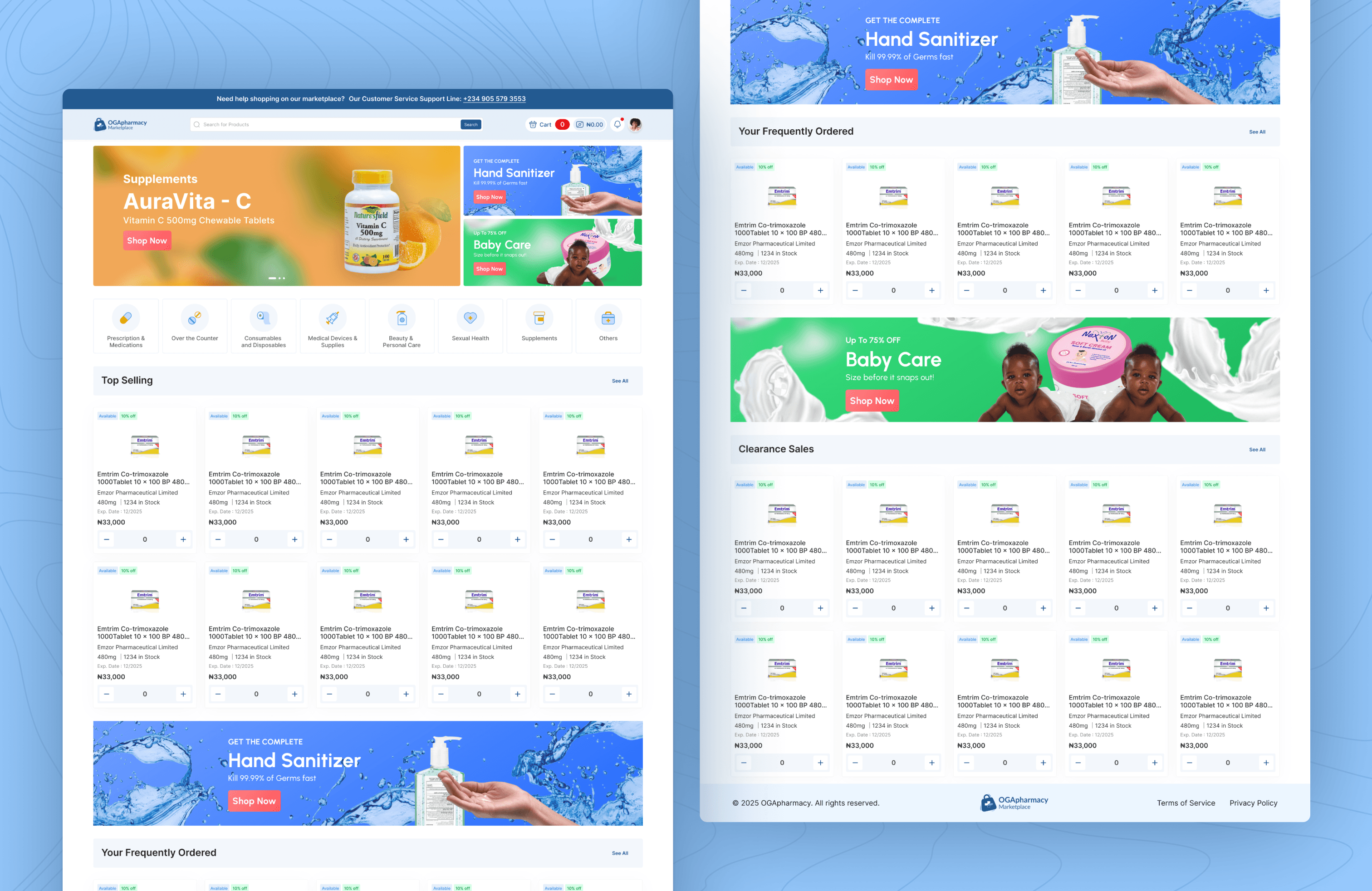
  1. Marketplace Redesign (Product Discovery)

  • Users now land directly on the marketplace instead of the manage orders page.

  • Product Categorization Introduced to improve speed and discovery:

    Top-selling products, Frequently Ordered, Clearance Sales, All Product Categories for easy sorting "See More" buttons added to prevent clutter while improving visibility.

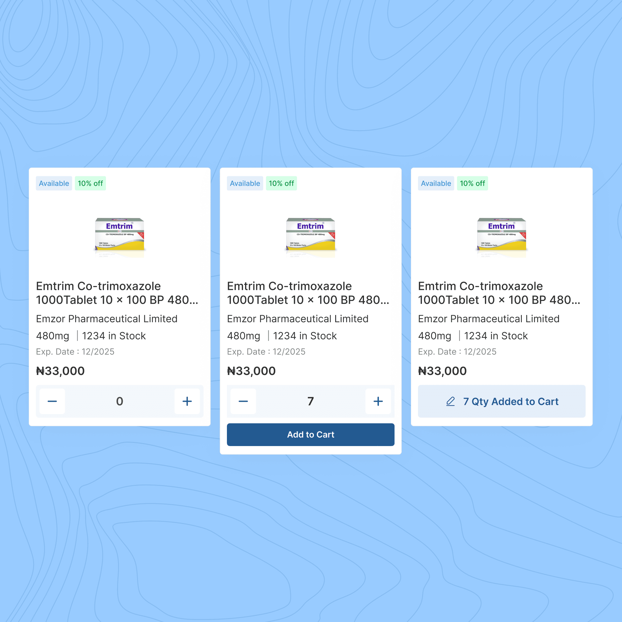
B. Product Card Revamp

  • Font changed from Montserrat to Inter for a more marketplace-friendly look.

  • Layout & tag design improved for better readability and a clean, modern UI.

  • Space Management: the former card had alot unnecessary spacings, and that was adjusted and made better and neater on the new design.

C. Product Details Page

  • Space management optimized for a better visual hierarchy.

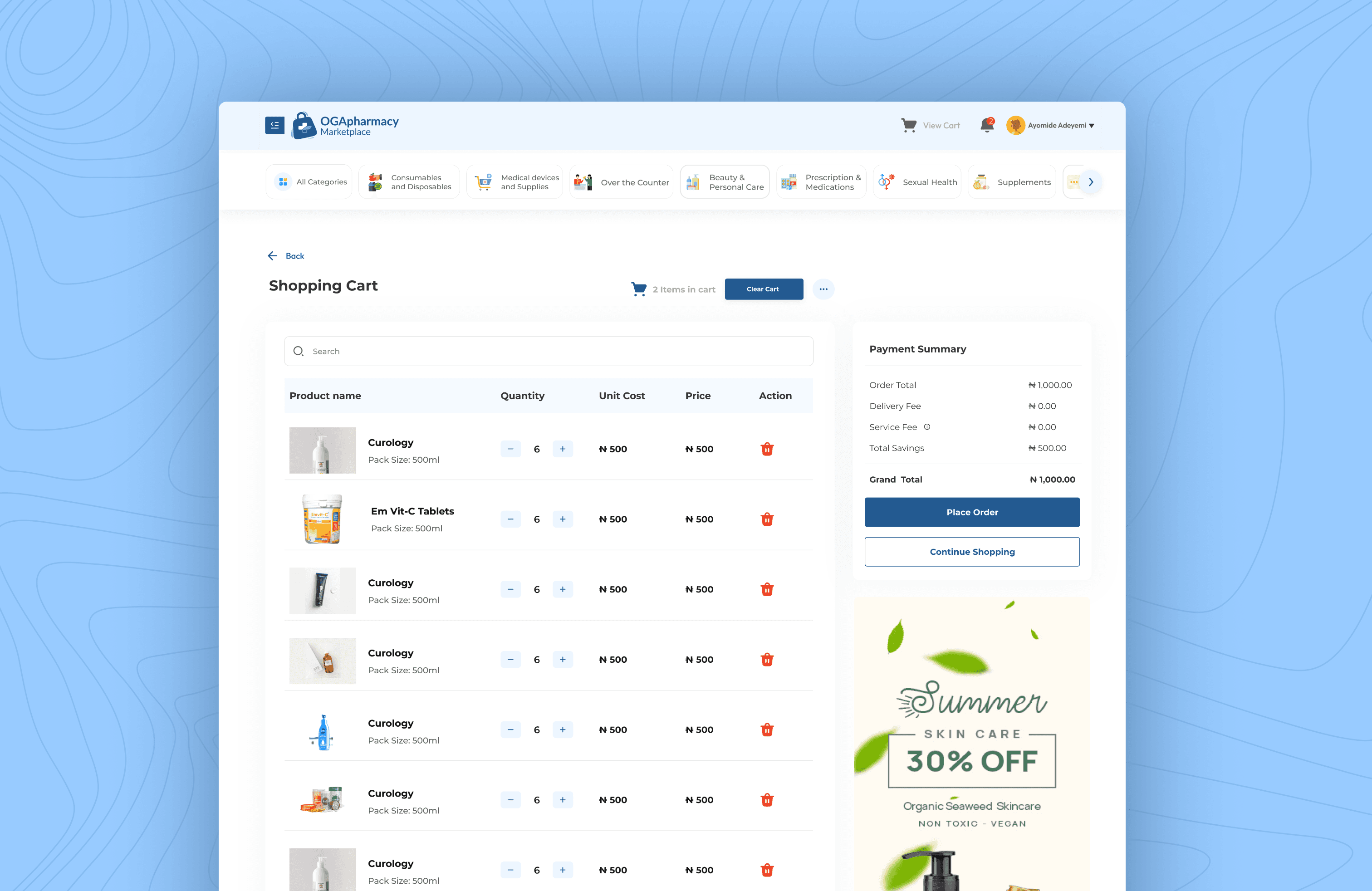
D. Cart & Checkout Experience


  • Sorting Features Added:

    All Products, Available, Quote Request Users can now filter products in their cart for better decision-making.

E. Order Management & Re-ordering

  • Layout optimized to remove unnecessary spaces.

  • Re-order button made more visible (previously hidden in an ellipsis menu).

  • Faster re-ordering = better user experience & potential sales increase.

Before Redesign

Before Redesign

After Redesign

After Redesign

F. Tracking Module Update

  • Revamped tracking interface for a more aesthetically pleasing and user-friendly experience.

Before Redesign

Before Redesign

After Cart Page Redesign

After Cart Page Redesign

G. Navigation & Rerouting

  • Old side menu removed to adopt a modern website-style navigation approach.

  • Navigation restructured for better usability.

Before Navigation Redesign

Before Navigation Redesign

After Navigation Redesign

After Navigation Redesign

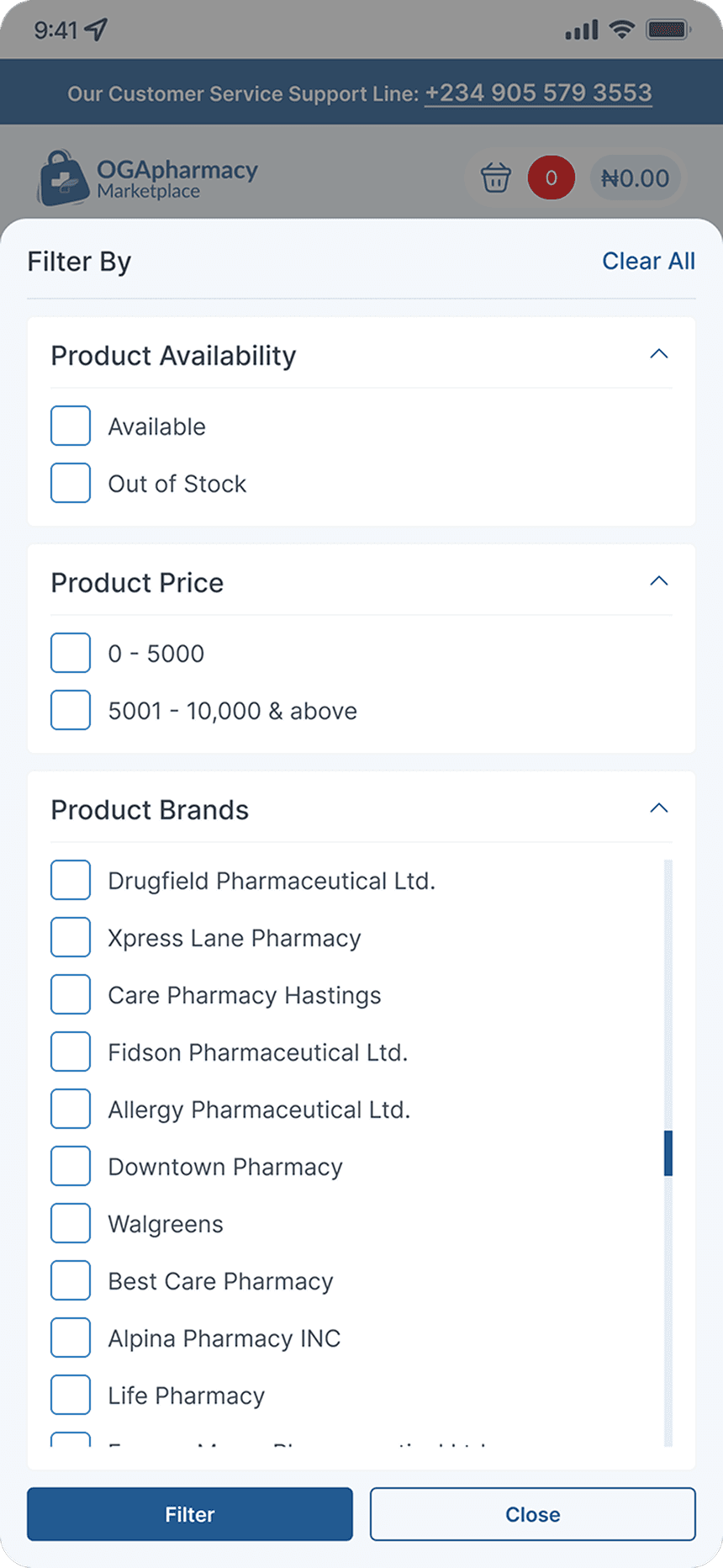
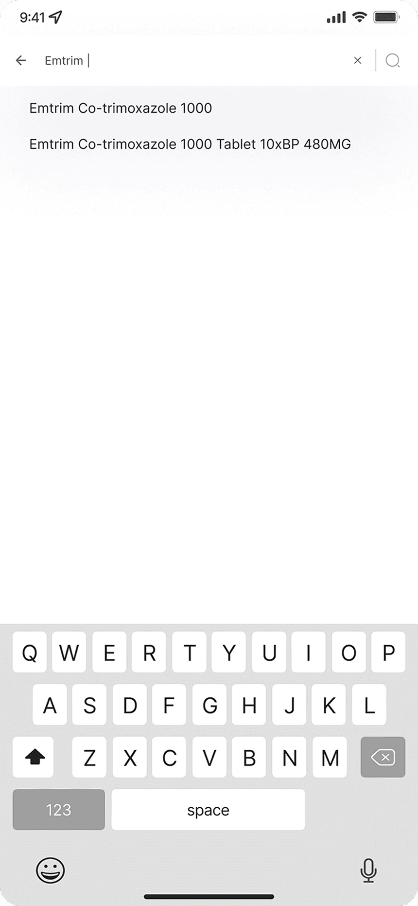
H. Mobile Screens

  • Mobile-first approach introduced to help users without laptop access.

  • Touch-friendly UI improvements for a better mobile experience.

  • Consistent design across desktop & mobile.

Before Redesign

Before Redesign

Some Mobile Screens After Redesign

Some Mobile Screens After Redesign

Challenges & Tradeoffs

Several constraints influenced the redesign process.

One challenge was balancing simplicity with the operational complexity of pharmacy procurement workflows.

Another challenge was improving speed without removing important information users relied on.

There was also the challenge of adapting a primarily desktop-oriented system into an experience that worked effectively across mobile environments.


One of the most important tradeoffs involved prioritizing efficiency over feature density.


Instead of adding more functionality into already complex flows, I focused on reducing friction and supporting the behaviors users performed most frequently.

Results & Impact

After the redesign was implemented, the marketplace experience became significantly more intuitive, scalable, and operationally efficient.

The most important shift was behavioral.

Pharmacies and affiliates were now able to place orders independently without relying heavily on sales representatives.


This transformed the platform from an assisted procurement process into a more scalable self-service ordering system.

Key outcomes included:

  • Pharmacies became more confident placing orders independently

  • Reduced operational dependency on internal sales personnel

  • Faster order placement due to reduced interaction steps

  • Improved repeat purchasing behavior among active users

  • Better product discovery through structured categorization

  • Improved accessibility across mobile and lower-spec devices

  • More consistent procurement behavior across affiliates

  • Improved efficiency in navigating and tracking orders

In active usage segments, repeat purchases increased significantly after the redesign, reinforcing the impact of reducing friction in high-frequency procurement behavior.

Reflection / Lessons Learned

This project reinforced the importance of designing for real-world operational behavior rather than idealized user journeys.

Key lessons included:
  • Users prioritize speed and familiarity over exploration in operational systems

  • Real-world field research reveals constraints that are not visible in interface reviews alone

  • Performance and device limitations are critical parts of accessibility

  • Small workflow improvements can create significant operational impact

  • Self-service adoption is often more about reducing friction than adding features

Most importantly, this project taught me that good product design is not only about making systems look better, it is about helping users perform critical tasks more confidently and independently.

Closing Reflection

This project was more than a marketplace redesign.

It was an operational transformation focused on reducing friction, improving accessibility, and enabling pharmacies to confidently manage procurement independently.

By combining field research, product thinking, systems design, and behavioral insights, the redesign helped shift the platform toward a faster, more scalable, and more self-sufficient procurement experience.

Before Marketplace Redesign

After Marketplace Redesign

Before Product Card Redesign

After Marketplace Redesign

Before Redesign

After Redesign

Before Redesign

After Cart Page Redesign

Project Overview

Project Name:
Role:
Timeline:
Team:
Tools Used

OGApharmacy Marketplace & Order Management Redesign

Lead Product Designer

2 weeks

Collaborated with Design and Product Management team (Team of 8)

Figma

Project Brief

I led the redesign of OGApharmacy’s platform, enhancing the user experience across the marketplace, order management, and mobile screens. The redesign improved navigation, product discovery, order tracking, and accessibility for users on both desktop and mobile. The goal was to optimize performance, increase user engagement, and improve conversions.

Problem Statement

User Experience & Navigation Issues
  • The marketplace lacked proper product categorization, displaying all products at once, which caused slow loading times and poor discovery.

  • The navigation structure was outdated, relying on a side panel instead of a modern, website-like approach.

  • Users previously landed on the Manage Orders page instead of the marketplace, adding extra friction to placing orders.

Order Management Issues
  • The Re-order button was hidden inside an ellipsis menu, making it harder for users to reorder quickly.

  • The tracking module was cluttered and lacked visual appeal.

Cart and Checkout Issues
  • The Re-order button was hidden inside an ellipsis menu, making it harder for users to reorder quickly.

  • The tracking module was cluttered and lacked visual appeal.

Mobile Accessibility Gap
  • The existing design was primarily desktop-focused, limiting access for users without laptops.

The Goal

  • To improve user onboarding and navigation by letting users land directly on the marketplace.

  • To enhance product discovery by introducing a structured product categorization system.

  • To improve order management and tracking with a cleaner layout and better action visibility.

  • To introduce cart sorting features for a smoother checkout process.

  • To design mobile-friendly screens to reach more customers.

My Design Process

Research & Discovery
  • Analyzed industry-leading e-commerce platforms for best practices in marketplace UI/UX.

  • Gathered insights from pharmacy users on their pain points with the old platform.

Define: Identifying Key Problems
  • Too many steps before placing an order.

  • Slow loading due to displaying all products at once.

  • Hard-to-find actions in order management.

  • Lack of sorting options in the cart.

  • Mobile experience needed improvement.

User Research Process

Thank you for your time!

Thank you for your time!

Create a free website with Framer, the website builder loved by startups, designers and agencies.